

Designing Responsive App Layouts for Foldable Devices
October 15, 2026
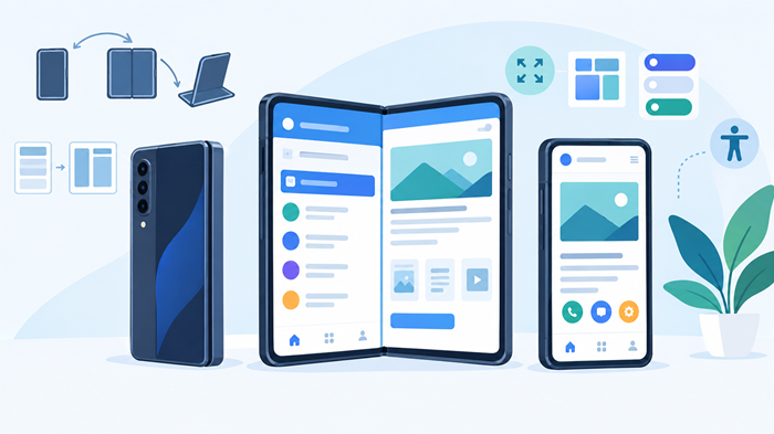
Foldable smartphones are changing how people interact with mobile applications. With screens that expand from a compact phone into a larger display, these devices create new opportunities for multitasking, content presentation, and more flexible user experiences. However, designing responsive app layouts for foldable devices requires more than stretching existing interfaces to fit a different screen size.
A successful approach to app layouts design considers screen dimensions, device posture, display transitions, touch interactions, and the way users move between compact and expanded views. By planning for these differences, businesses can deliver consistent, intuitive experiences across traditional smartphones and foldable devices.
Key Takeaways
-
Design flexible interfaces that adapt to different screen sizes and device postures.
-
Prioritize readable content, accessible controls, and consistent navigation.
-
Use expanded screens to support multitasking and contextual layouts.
-
Test across device configurations to identify usability and performance issues.
What Makes Foldable Devices Different?
Traditional smartphones typically offer a single display configuration. Foldable devices introduce multiple screen states, allowing users to switch between a compact outer screen and a larger inner display.
This flexibility changes how applications should organize information. A layout that works well on a narrow screen may appear stretched, crowded, or poorly balanced when opened on a larger display.
Effective app layouts design accounts for these changing conditions without compromising usability.
Understanding Screen Sizes and Device Postures
Foldable phones can operate in several configurations, including fully folded, fully unfolded, and partially folded positions. Some devices also support tabletop-style use, where the screen remains open at an angle.
Each configuration creates different interaction possibilities. A compact display may benefit from simplified navigation, while an expanded screen can accommodate additional content or multiple panels.
Designers should consider the available screen area, aspect ratio, hinge position, and touch targets rather than relying exclusively on fixed screen dimensions.
Why Traditional Mobile Layouts May Fall Short
Interfaces built for conventional smartphones often use rigid dimensions, fixed-width components, or navigation patterns optimized for narrow screens.
When displayed on a larger surface, these interfaces can leave excessive empty space or stretch content beyond comfortable reading widths. Some applications also fail to account for the hinge area, which can interrupt important content or controls.
A flexible layout system helps prevent these problems while keeping the experience familiar across devices.
Best Practices for Designing Responsive App Layouts
Creating adaptable interfaces starts with understanding how content, navigation, and interactions should change as the available display area changes.
The following practices can help teams build reliable experiences for foldable smartphones.
1. Build Flexible Layouts Instead of Fixed Screens
The foundation of app layouts design is flexibility. Rather than assigning every element a fixed width and height, use adaptable containers, scalable spacing, and layout rules that respond to available space.
Responsive layouts should reorganize content when necessary instead of simply enlarging every component. For example, a product list that occupies the full width of a compact screen could become a two-column grid on a larger display.
Developers can use responsive constraints, breakpoints, and platform-supported window size classes to determine when a layout should change. These rules should reflect the available space, not just a particular device model.
2. Design for Multiple Screen Configurations
A foldable application should feel complete when the device is closed and become more capable when the larger display is available.
The compact interface should prioritize essential actions, readable text, and straightforward navigation. The expanded interface can introduce additional panels, richer previews, or supplementary information without overwhelming users.
For example, a shopping application might display product cards on the outer screen and present product details alongside recommendations on the inner screen.
Understanding the different types of mobile apps can also help teams select an application structure that suits their product’s functionality and audience.
3. Make the Most of Expanded Screen Space
Larger displays create opportunities to present related information together. Instead of enlarging a single column, designers can use additional space to reduce navigation steps and support more efficient workflows.
A note-taking application could display a document alongside its outline. A travel application might show an itinerary next to destination details, while a productivity tool could present a task list beside a calendar.
Thoughtful app layouts design uses extra screen space to improve task completion rather than merely changing the interface’s appearance.
However, additional panels should remain optional when they are not essential. The primary task must stay clear, even when several content areas are visible.
4. Account for the Hinge and Screen Boundaries
The hinge is an important consideration when designing interfaces for foldable devices with separate display regions.
Avoid positioning critical text, buttons, form fields, or interactive elements directly beneath a crease when that area affects visibility or touch interaction. Instead, consider arranging content into separate panels that work naturally with the device’s physical structure.
Developers should also respect system-provided display features, including safe areas, window insets, and folding-feature information where available.
Testing on actual hardware helps identify issues that may not be apparent in a desktop simulator.
5. Create Consistent Navigation Across Screen Sizes
Navigation should remain predictable when users fold or unfold their devices.
A bottom navigation bar may work well on a compact display, while a navigation rail or persistent sidebar may be more suitable for an expanded interface. The specific arrangement can change, but core actions and information architecture should remain consistent.
Well-planned app layouts design avoids forcing users to relearn the application whenever the screen changes.
Maintain the current task, selected item, entered text, and other relevant state during transitions. This prevents unnecessary interruptions and helps users continue their activities naturally.
6. Support Multitasking and Contextual Interactions
Foldable devices are particularly useful for tasks that involve comparing information, switching between activities, or working with multiple content areas.
Consider interfaces that support drag-and-drop interactions, side-by-side views, and contextual actions where they genuinely improve the experience. For example, a file management application could let users move documents between two visible folders.
Multitasking features should complement the application’s primary purpose. Adding multiple panels without a clear user benefit can make the interface unnecessarily complicated.
7. Prioritize Accessibility and Readability
Expanded screens do not automatically make an application more accessible. Small text, inconsistent contrast, difficult touch targets, and confusing focus order can still create usability barriers.
Use readable typography, sufficient contrast, descriptive labels, and controls that are comfortable to operate. Ensure that layouts remain usable with screen readers, keyboard navigation, and system text scaling.
Following guidance on designing accessible mobile apps helps teams create inclusive experiences across different display configurations and user needs.
8. Optimize Onboarding for Changing Layouts
Users should understand how an application responds when a device changes configuration. However, they should not need lengthy tutorials to use basic features.
Provide brief contextual guidance when an expanded screen introduces a useful feature, such as a second content panel or a new drag-and-drop interaction.
The best mobile UX patterns can help teams introduce these capabilities without interrupting the user’s primary task.
Choosing the Right Layout Patterns for Foldable Apps
Different applications benefit from different layout approaches. The most effective choice depends on the content, task complexity, and available display area.
Single-Column Layouts
Single-column interfaces remain useful for reading, messaging, forms, and other focused tasks. They are simple to navigate and adapt well to compact displays.
On larger screens, constrain the content width and use appropriate spacing instead of stretching text across the entire display.
List-Detail Layouts
List-detail layouts display a collection of items alongside the selected item’s information. They work especially well for email clients, messaging tools, product catalogs, and document management applications.
On a compact screen, users can open one item at a time. On a larger screen, both the list and the selected content can remain visible.
Multi-Panel Layouts
Multi-panel interfaces can improve productivity when users need to access related information simultaneously. Examples include dashboards, project management tools, and creative applications.
Keep the hierarchy clear and ensure that each panel has a distinct purpose. Too many competing sections can make even a large display difficult to navigate.
Selecting the best app layouts requires evaluating real user tasks rather than choosing a pattern simply because the device supports a larger screen.
Responsive Design Across Foldable and Traditional Devices
A strong responsive strategy should support more than one category of smartphone. It should accommodate conventional phones, tablets, and foldable devices without maintaining an entirely separate interface for every model.
For example, responsive app design can use available window dimensions to determine whether content should remain in one column or reorganize into multiple sections.
Teams working on iphone app layouts should also account for Apple’s supported iPhone and iPad display configurations, while Android teams should use the platform’s window-management and adaptive-layout capabilities where appropriate.
A foldable mobile phone may offer several display states, but developers should not assume that every model behaves identically. Screen proportions, hinge designs, operating-system features, and multitasking support can vary between manufacturers.
Applications should also preserve their state during resizing, rotation, folding, unfolding, and window changes. A responsive app should adjust smoothly without unexpectedly resetting the user’s progress.
Testing and Performance Optimization
Testing is essential because an interface that looks correct in a design tool may behave differently on real hardware.
Test Across Screen Sizes and Postures
Evaluate the application on compact and expanded displays, as well as supported intermediate configurations. Check text wrapping, scrolling, navigation, touch targets, and the placement of important controls.
Where supported, test split-screen use, multiple windows, and transitions between device postures.
Check Performance During Transitions
Folding and unfolding can trigger layout recalculations and configuration changes. Poorly managed updates may cause flickering, repeated loading, or lost application state.
Optimize rendering, preserve relevant data, and avoid unnecessary network requests during transitions. Automated tests can cover common configurations, while physical-device testing helps validate touch interactions and real-world behavior.
Security should also remain part of the release process. Understanding what is mobile application security testing helps teams identify vulnerabilities before an application reaches users.
The overall app development timeline will depend on the application’s complexity, the number of supported configurations, and the amount of testing required.
Common Mistakes to Avoid
Several design decisions can reduce the quality of a foldable application:
-
Stretching content excessively: Use readable content widths and purposeful spacing.
-
Ignoring the hinge: Keep important information and interactive controls away from problematic display regions.
-
Creating inconsistent navigation: Preserve familiar actions and information architecture across screen states.
-
Ignoring state preservation: Retain entered information and task progress during layout changes.
-
Testing only in emulators: Validate critical interactions on physical devices.
-
Adding unnecessary complexity: Use expanded space to support genuine user needs rather than filling every available area.
Avoiding these mistakes helps ensure that larger displays provide practical value instead of introducing new usability problems.
How JNA Can Help With Mobile App Design
Successful foldable applications require a combination of user experience planning, interface design, responsive development, and quality assurance. Businesses need a strategy that connects technical decisions with customer expectations and product objectives.
JNA is a full service digital marketing agency that helps businesses strengthen their digital presence through strategic digital solutions. People searching for mobile app design agency, can be a relevant starting point for organizations exploring application development, user experience improvements, and digital product opportunities.
A well-planned project should begin with user research, content prioritization, and clear functional requirements. From there, design teams can establish responsive layout rules, create prototypes for different screen configurations, and validate the experience through usability testing.
This process helps businesses build applications that are adaptable, intuitive, and prepared for changing mobile hardware.
Conclusion
Designing for foldable smartphones is about making applications more adaptable, not simply making them larger. Effective app layouts design combines flexible layouts, consistent navigation, accessible interactions, and thoughtful use of expanded screen space.
By considering device posture, hinge placement, responsive behavior, and real-world testing from the beginning, teams can deliver a smoother experience across traditional and foldable devices.
The goal is straightforward: help users complete their tasks comfortably, regardless of how their device is configured.
Frequently Asked Questions
1. What is responsive app layout design?
Responsive app layout design adapts an application’s content, navigation, and interface elements to available screen dimensions and configurations.
2. Why do foldable devices need adaptive layouts?
Foldable devices change screen size and posture, so applications must reorganize content to maintain usability across different configurations.
3. How should apps handle a foldable screen’s hinge?
Applications should account for folding features and display boundaries, keeping critical content and interactive controls in usable screen regions.
4. What are the best layouts for foldable applications?
List-detail, multi-panel, and flexible single-column layouts are useful choices, depending on the application’s content and user tasks.
5. How can developers test foldable app layouts?
Developers should combine emulators, automated tests, and physical-device testing to evaluate screen transitions, navigation, readability, and state preservation.