

How to Design Accessible Mobile Apps That Work for All
August 19, 2026
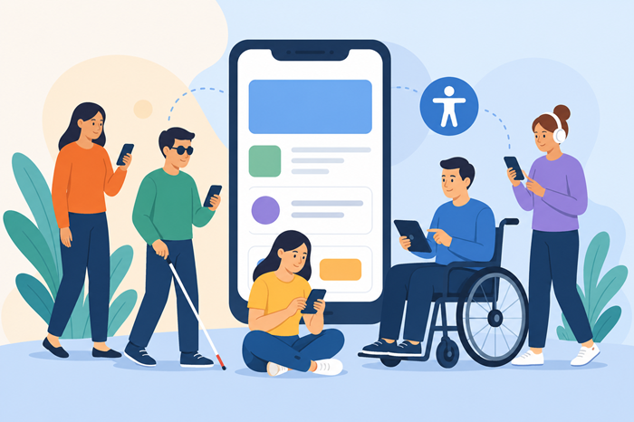
Designing for a mobile audience means thinking beyond attractive screens, smooth animations, and fast performance. A truly inclusive product should be easy to understand and operate for people with different abilities, devices, preferences, and levels of digital experience. Learning how to design accessible mobile apps starts with treating accessibility as part of the product strategy rather than something added just before launch.
From navigation and typography to touch targets, screen readers, color contrast, and error handling, every design decision can affect usability. When accessibility is considered from the beginning, teams can create experiences that feel more intuitive for everyone while reducing costly redesigns later.
Key Takeaway
-
Build accessibility into UX planning instead of treating it as a final testing step.
-
Use clear navigation, readable typography, strong contrast, and appropriately sized touch targets.
-
Test with assistive technologies and real users with different accessibility needs.
-
Combine accessibility with performance, security, and mobile-first design principles.
What Does Accessible Mobile App Design Mean?
Accessible design means creating a digital experience that people with different physical, sensory, cognitive, and visual abilities can use effectively.
This includes users who rely on screen readers, voice controls, magnification, captions, keyboard alternatives, larger text, or other assistive technologies. It also benefits people dealing with temporary limitations, such as a broken arm, poor lighting, or a noisy environment.
Accessibility is not a separate visual style. It is a design approach that considers how people perceive information, navigate interfaces, interact with controls, and recover from mistakes.
Start With Accessibility During UX Planning
One of the most common mistakes is designing the complete interface first and checking accessibility afterward. By that stage, fixing structural problems can require changes across screens, components, and development work.
Instead, include accessibility requirements when defining user journeys, wireframes, information architecture, and design systems.
A useful approach is to ask questions such as:
-
Can users understand what each screen is for?
-
Can someone navigate without relying solely on gestures?
-
Are important actions clearly identifiable?
-
Can text be enlarged without breaking the interface?
-
Are instructions understandable without depending only on color?
-
Can assistive technologies identify interactive elements correctly?
These questions help designers identify accessibility barriers before they become expensive development problems.
Make Navigation Simple and Predictable
Good navigation is essential for an inclusive experience. Users should be able to understand where they are, what they can do next, and how to return to a previous step.
Keep navigation patterns consistent throughout the product. If a button performs a particular action on one screen, it should behave similarly elsewhere.
Avoid unnecessary gestures when a simple button or alternative control can perform the same function. Swiping, dragging, pinching, and other gesture-based interactions can be useful, but they should not be the only way to complete an important task.
Clear labels also matter. A label such as “Continue to payment” communicates more than a vague button that simply says “Next.”
For teams working on the product implementation, partnering with a mobile app development agency can also help connect accessible design requirements with practical development decisions.
Use Readable Typography and Clear Content
Typography directly affects how comfortably people can read and understand an interface.
Choose typefaces that remain legible at different sizes and avoid overly decorative fonts for important information. Give text enough spacing so letters, words, and lines do not appear crowded.
Do not rely on tiny text to fit more information onto a screen. A cleaner interface with fewer words is often more usable than a dense layout.
Content structure matters, too. Use descriptive headings, short instructions, recognizable terminology, and clear labels. When users can scan content quickly, they spend less effort figuring out what the interface is asking them to do.
Design Strong Color Contrast
Color should support communication, not carry the entire meaning of an interface.
For example, displaying an error only by turning a field border red may not provide enough information for someone who cannot distinguish that color. Pair color with a message, icon, or other visual indicator.
Similarly, make sure foreground text stands out clearly against its background. Check contrast for buttons, labels, form fields, navigation elements, and important status messages.
A well-designed color system should also account for different display conditions, including sunlight, low brightness, and dark environments.
Create Comfortable Touch Targets
Small controls can make a mobile interface frustrating even when the visual design looks polished.
Interactive elements should have enough space around them to reduce accidental taps. This is particularly important for buttons placed close together, navigation controls, checkboxes, and form elements.
Do not judge touch usability only from a large desktop monitor. Test the interface on real phones and consider how it feels when users operate it with one hand or while moving.
Spacing is just as important as the visible size of the control. Adequate separation between interactive elements can make an interface significantly easier to operate.
Support Screen Readers and Assistive Technologies
Visual accessibility is only one part of the picture. An interface should also communicate correctly with assistive technologies.
Interactive controls need meaningful names and descriptions. Images that communicate important information should have appropriate alternative text, while purely decorative images should not create unnecessary noise for screen-reader users.
The reading order should make sense as well. If information appears visually in one order but is announced in a confusing sequence, users may struggle to understand the screen.
Developers should also ensure that custom components expose the right semantic information to the operating system’s accessibility framework.
Make Forms Easier to Complete
Forms are often where accessibility problems become most obvious.
Use explicit field labels rather than relying exclusively on placeholder text. Give users clear instructions about required information and acceptable formats before they submit the form.
Error messages should explain what went wrong and how to fix it. If possible, move focus toward the problematic field or clearly identify where attention is required.
Avoid unnecessarily complicated forms. Asking only for information that is genuinely needed reduces cognitive effort and makes the overall process faster for everyone.
Think About Motion and Animation
Animations can make an interface feel responsive, but excessive movement may create usability problems.
Avoid animations that play continuously without a clear purpose. Give users appropriate control over motion where practical, particularly when movement is not necessary to complete an action.
Transitions should also be fast enough that they do not slow down navigation. A product should feel responsive rather than forcing users to wait for decorative effects.
Follow the Best Mobile UX Patterns for Onboarding
Onboarding deserves special attention because it introduces users to the product and establishes their expectations.
Keep the initial experience focused. Avoid presenting several complicated screens before users can access the main functionality.
Clear progress indicators, concise instructions, descriptive controls, and the ability to skip unnecessary steps can make onboarding more approachable.
Teams can also review the best mobile ux patterns when planning onboarding flows that balance guidance with simplicity.
Test Accessibility With Real Devices
A design that looks accessible in a design tool may behave differently on an actual phone.
Test across different screen sizes, operating systems, font settings, and accessibility configurations. Increase text size, activate screen readers, change display settings, and test the interface using alternative interaction methods.
Automated tools can identify some technical problems, but they cannot replace hands-on testing. Human testing can reveal confusing language, awkward navigation, unclear feedback, and interaction barriers that automated checks may miss.
The broader the testing process, the more likely the final product is to work well for a diverse audience.
Include Mobile Application Security Testing
Accessibility and security should be considered together rather than treated as competing priorities.
For example, authentication flows should remain secure without creating unnecessary barriers. Error messages should provide useful guidance without revealing sensitive information. Recovery processes should be understandable while still protecting user accounts.
Teams should incorporate mobile application security testing into the development lifecycle so that usability and protection are evaluated alongside each other.
Optimize Performance for Inclusive Experiences
Slow interfaces can become accessibility problems when users are forced to wait for content, repeat actions, or deal with inconsistent loading states.
Optimize images, reduce unnecessary processing, and make important content available quickly. Provide meaningful loading feedback when an operation takes time.
Performance also matters for users on slower connections or older devices. A lightweight interface can provide a more consistent experience across a broader range of users.
For a practical performance review, teams can use a core web vitals checklist for better mobile-first seo alongside their broader mobile performance process.
Build Accessibility Into the Development Process
Accessibility works best when designers, developers, content teams, testers, and product managers share responsibility.
Create reusable accessible components so teams do not have to solve the same problems repeatedly. Document interaction rules, typography requirements, color choices, focus behavior, and accessibility states within the design system.
During development, accessibility requirements should be included in acceptance criteria rather than treated as optional enhancements.
This approach makes accessibility measurable and helps prevent regressions as new features are introduced.
Understand the Role of Mobile App Development Services
The technical implementation of accessibility can vary considerably depending on the platform, framework, architecture, and interface components being used.
A capable team should understand both the design intent and the technical requirements behind accessible experiences. This includes semantic labeling, focus management, dynamic text sizing, accessible gestures, system-level accessibility APIs, and testing workflows.
When comparing providers, look beyond a portfolio of attractive interfaces. Ask how they approach testing, accessibility requirements, performance optimization, maintenance, and future feature updates.
Budget is another practical consideration. Before selecting a partner, understanding the cost to hire a mobile app development agency can help you set realistic expectations around design, development, testing, and ongoing support.
Common Accessibility Mistakes to Avoid
Even well-intentioned teams can overlook basic accessibility issues.
Common mistakes include:
-
Using color as the only way to communicate meaning.
-
Creating buttons with unclear labels.
-
Making touch targets too small or too close together.
-
Ignoring larger text settings.
-
Providing images without meaningful alternatives.
-
Relying entirely on automated accessibility testing.
-
Making important functions dependent on complex gestures.
-
Adding accessibility checks only immediately before launch.
Avoiding these problems early is generally easier than rebuilding an interface after users encounter barriers.
A Practical Accessibility Workflow
A straightforward workflow can make accessibility easier to manage throughout a project.
1. Define Accessibility Requirements
Identify the users, platforms, assistive technologies, and accessibility expectations relevant to the product.
2. Design Accessible User Flows
Review navigation, forms, content hierarchy, controls, and interaction patterns before detailed visual design begins.
3. Build Reusable Components
Create accessible buttons, inputs, dialogs, navigation elements, and other reusable components rather than fixing each screen independently.
4. Test During Development
Run automated checks and manual tests throughout development instead of waiting until the final release candidate.
5. Test With Real Users
Where possible, include people with different accessibility needs in usability testing.
6. Monitor After Launch
Accessibility is not finished at release. Continue reviewing feedback, bug reports, analytics, and new features to identify barriers over time.
Why Accessibility Improves the Overall User Experience
Accessibility improvements frequently make products better for users who do not consider themselves disabled.
Clear labels help everyone understand actions faster. Strong contrast improves readability in bright environments. Larger touch targets reduce accidental taps. Captions help people watching videos without sound. Simple navigation reduces frustration for new and experienced users alike.
The result is not merely a more compliant interface. It is a product that communicates more clearly and removes unnecessary friction.
Final Thoughts
Accessible design should be treated as a fundamental part of creating a useful mobile product. From navigation and typography to screen readers, forms, motion, performance, and testing, small decisions can have a significant effect on how people interact with an interface.
The strongest approach is to build accessibility into the process from the beginning. When accessibility is considered during research, design, development, testing, and maintenance, teams can create products that are easier to use, more resilient, and more welcoming to a wider audience.
FAQs
1. What is accessible mobile app design?
It is the practice of designing mobile experiences that people with different abilities can perceive, understand, navigate, and operate.
2. Why is accessibility important in mobile app design?
Accessibility removes interaction barriers and makes the product easier to use for a broader range of people.
3. How can I test accessibility in a mobile app?
Use automated checks, manual testing, assistive technologies, real devices, and usability testing with people who have different accessibility needs.
4. What are common mobile accessibility problems?
Common issues include poor contrast, small touch targets, unclear labels, inaccessible gestures, missing alternative text, and confusing error messages.
5. When should accessibility testing begin?
Accessibility testing should begin during planning and continue throughout design, development, release, and ongoing product updates.